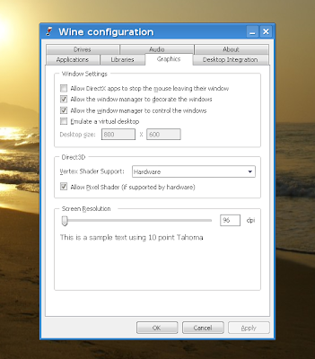
By default, Windows applications which run through Wine don't look very well, since that's the look and feel of Windows 98 at best, to mention nothing about XP:
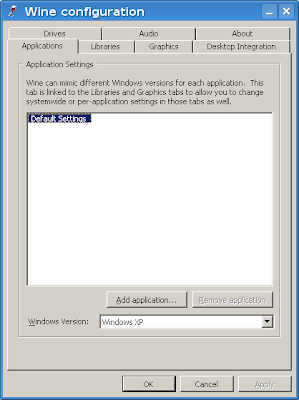
So what follows are a few easy steps which will allow to change the way applications ran through Wine look like. If you need guidance for installing Wine, here are two tutorials I recently wrote, for Ubuntu 8.04 here and here, and for Debian Lenny here. These should also work in Ubuntu 8.10 (and the upcoming 9.04 Jaunty Jackalope) and the latest Wine release.
1. Download some MS styles from deviantART
First, you will need to get some themes from here. For my example I will be using VistaPerfection X4 (direct download link). After saving it, uncompress the ZIP file and copy the .msstyles file (in our example the file is called VistaPerfection.msstyles) in a location of your choice.
2. Run winecfg and install the theme
Next, run the Wine configuration utility, winecfg, and under the Desktop Integration tab, click the Install theme... button, then navigate to where your .msstyles file is located and select it.
Select the .msstyles file for installation
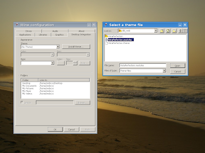
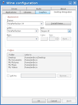
Now under the Theme drop-down menu, select the VistaPerfection X4 theme and then click OK. This should be all and the new theme should be now installed. Notice that you can still configure the colors if you don't like the default ones.
The look of Wine applications with VistaPerfection X4
Running Notepad
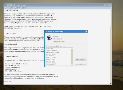
The VistaX theme
Notice: I bumped into this short tutorial in a post on UbuntuForums, here.
6 comments:
Two nice Ubuntuish/Humanish WinXP themes, that can be used in wine:
http://schmoove.deviantart.com/art/ClearLooks-for-Windows-XP-18591720
http://fioressj.deviantart.com/art/Human-for-Windows-37743373
Hello,
I have a Wine colour and theme support guide at Wine-Reviews.
Attila, thanks for sharing those two themes.
Hey, twickline, that tutorial really shows very well, thanks for mentioning it. Those colour changes really make it look nicer.
By the way, where can I contact you (if you're interested) for a link exchange with your blog http://wine-review.blogspot.com/?
Thks!
+1
Post a Comment